From the WIAD Zurich Team: Fabienne Gafner, Andrea Rosenbusch and Laura Sgier
World IA Day Switzerland is an annual one-day conference focused on Information Architecture. Listen to fabulous Swiss and international speakers and meet other IA and UX maniacs.
This year theme is Information Strategy & Structure. The opening keynote “Designing for the Human Scale” will be held by Andy Fitzgerald and closing keynote “Design for Real Life” by Sara Wachter-Boettcher. We’re looking forward to listen to these and other Speakers talks. We are also looking forward to exchanging learnings and best practices with participants.
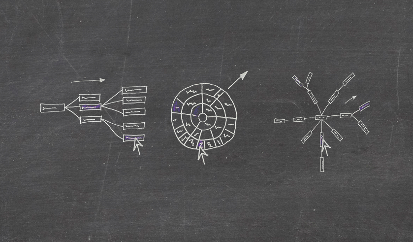
Presenting multi-hierarchical information is tricky. A multi-hierarchy is a sort of tree where any leaf can be on several branches at the same time.
I’ve been researching possible options to represent software parts and how they depend on each other. The trade-off seems to be between supporting the reading flow, helping to grasp details quickly, or giving priority to the overview. Which visualization style would you pick?
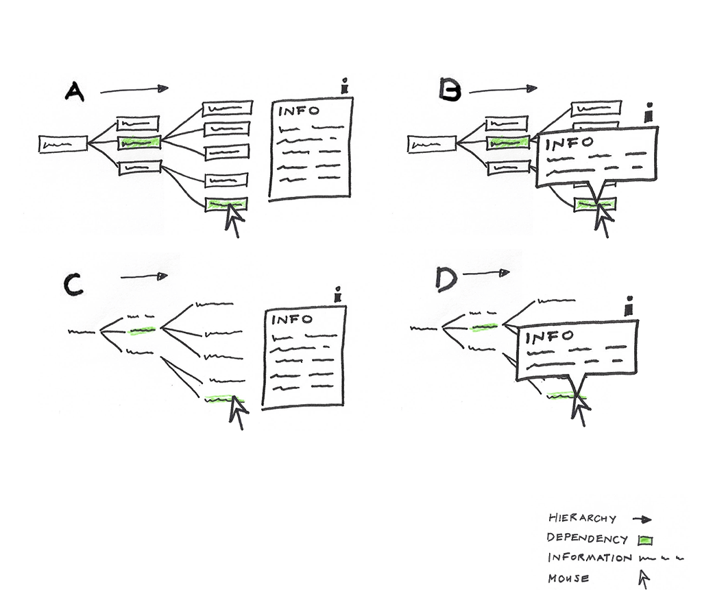
Supporting the reading flow
The visualization as a cluster dendrogram is using the space efficiently. The hierarchy is visible from left to right. It is widely used and can be seen in many visual depictions.The labels are readable. On the other hand the information box, if it’s placed by the label will cover other labels.
Displaying hierarchical information with dependent relationships and their text labels as a zoomable sunburst
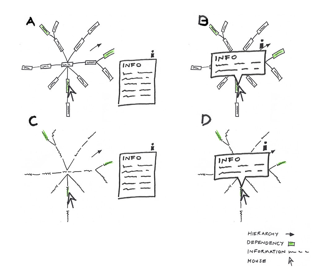
Helping to grasp information quickly with interaction
Sunburst, the interactive graph helps the user to understand the information quickly through its graphical interface and user experience. To zoom in the sunburst click on any arc and to zoom out click on the center.
This visually appealing graph has also down sides. When navigating through the sunburst you don’t know on which arc you are, so the level is not clear. Apparently in many examples text labels are even hidden or cut off. In addition, it needs a systematic usage of the colors. If you place it on a dashboard it consumes a lot of white space.
Displaying hierarchical information with dependent relationships and their text labels as a zoomable sunburst.
Presenting an overview
The tree layout with radial orientations is displaying an overview of the information in a circular manner. This visual has the advantage to see the interlinks and dependencies with bird-eye view. In addition, this visual also uses space efficiently. Contrarily, the label are displayed upside-down.
Displaying hierarchical information with dependent relationships and their text labels as a Radial Reingold-Tilford Tree.
Which visualization style would you use to present multi-hierarchical information? Thanks for leaving a comment.